TRIPLE CINTRE – Ines Claus – Nodenaysteen Gent
Interview with Hilde Van Canneyt
Hilde Van Canneyt (HVC): – Dear Ines, six years ago you graduated from KASK School of Arts in Ghent. The burden of the teachers has been lifted, and you have been working autonomously for five years now. You didn’t have to fight for that at home, as your parents also studied painting.
Ines Claus – They studied at the Royal Academy of Fine Arts in Antwerp. For my sister and me, it was always a natural way of engaging with drawing, looking at art books, visiting museums, etc. During puberty, this was less pronounced, but when my sister took her entrance exam for Animation Film at KASK, I started following that website and saw that you could study autonomous Drawing Art there. I was drawn to starting purely from drawing.
HVC: Starting from the line, you mean? Or were you more attracted to the drawing techniques with pencil, charcoal, chalk, and pastels on paper?
I don’t know if this was clear back then, but indeed, that ‘simplicity’, directness, and honesty of that pencil on paper appealed to me. Although it’s not an easy program, I loved that freedom. Also, the fact that autonomous drawing is less associated with history than, for example, painting or sculpture creates an openness.
HVC: How were those lessons approached? In the first years, I assume some framework was provided in the exploration of form, content, and materials?
Indeed, it was mainly about the question: what does drawing entail? I remember the theme of waste. You literally had to search for it. While you examine all those materials that pass by, you carve out your own path towards a personal visual language. I immediately enjoyed the directness and speed of blind drawing. This quick drawing allows you to abstract and seek a kind of essence.
In my Master’s, I was working with objects and installations, among other things. I was also looking for more materials to draw on: pieces I found on the street, for example, which I found interesting in color. Or I discovered mops that I liked to work with. But eventually, I found it too restrictive, so I sought materials that had infinity, like ink and graphite. Although I created books with those mops that I laminated. Or I liked to experiment with spray cans and acrylics to have a conversion of drawing ‘in color’, and then you quickly find yourself at the edge of painting. But then I sometimes found the paper too limiting in terms of scale, so I started to be drawn to canvas. (laughs)
HVC: What was your content-related research? Were there specific ‘themes’ you wanted to dive into or address?
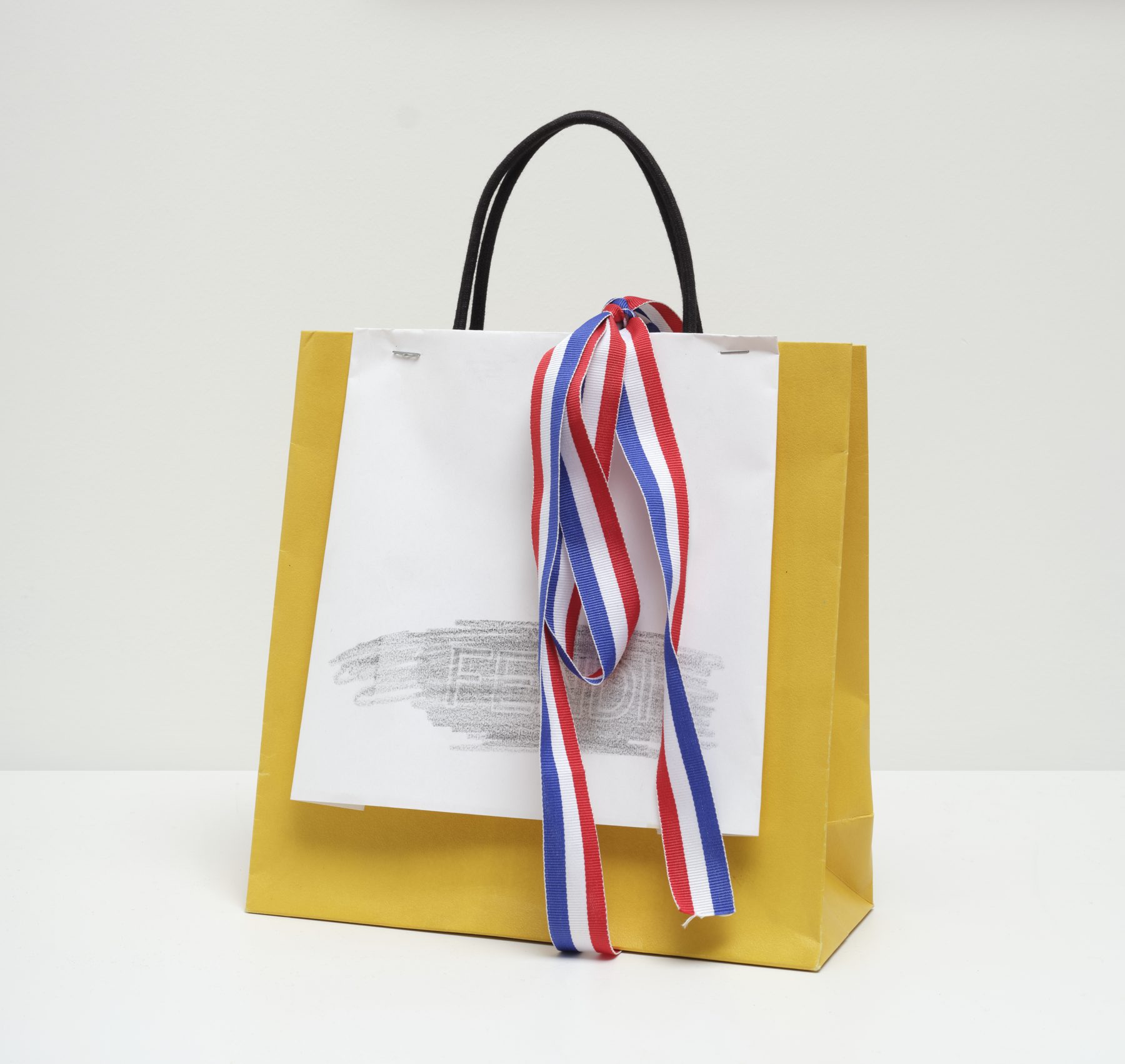
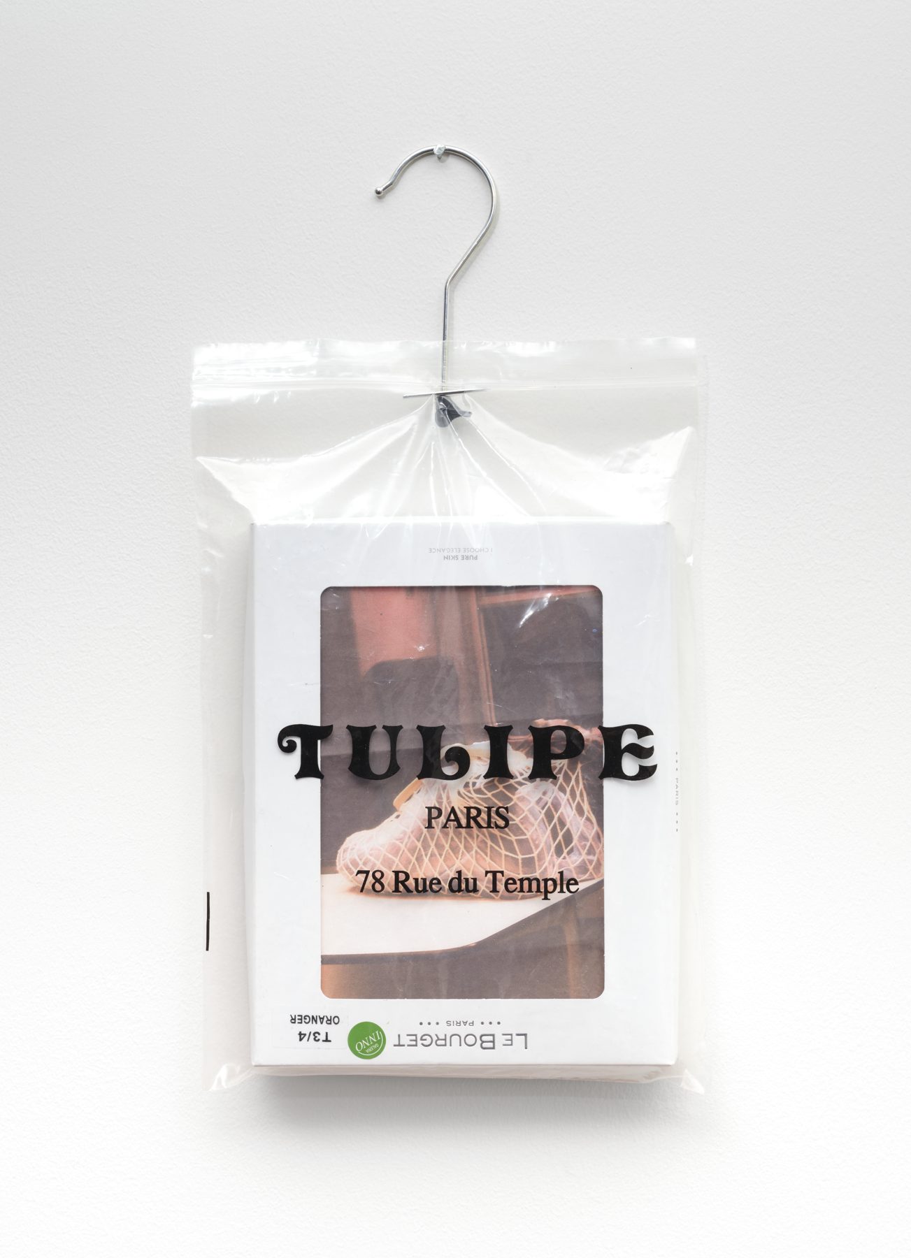
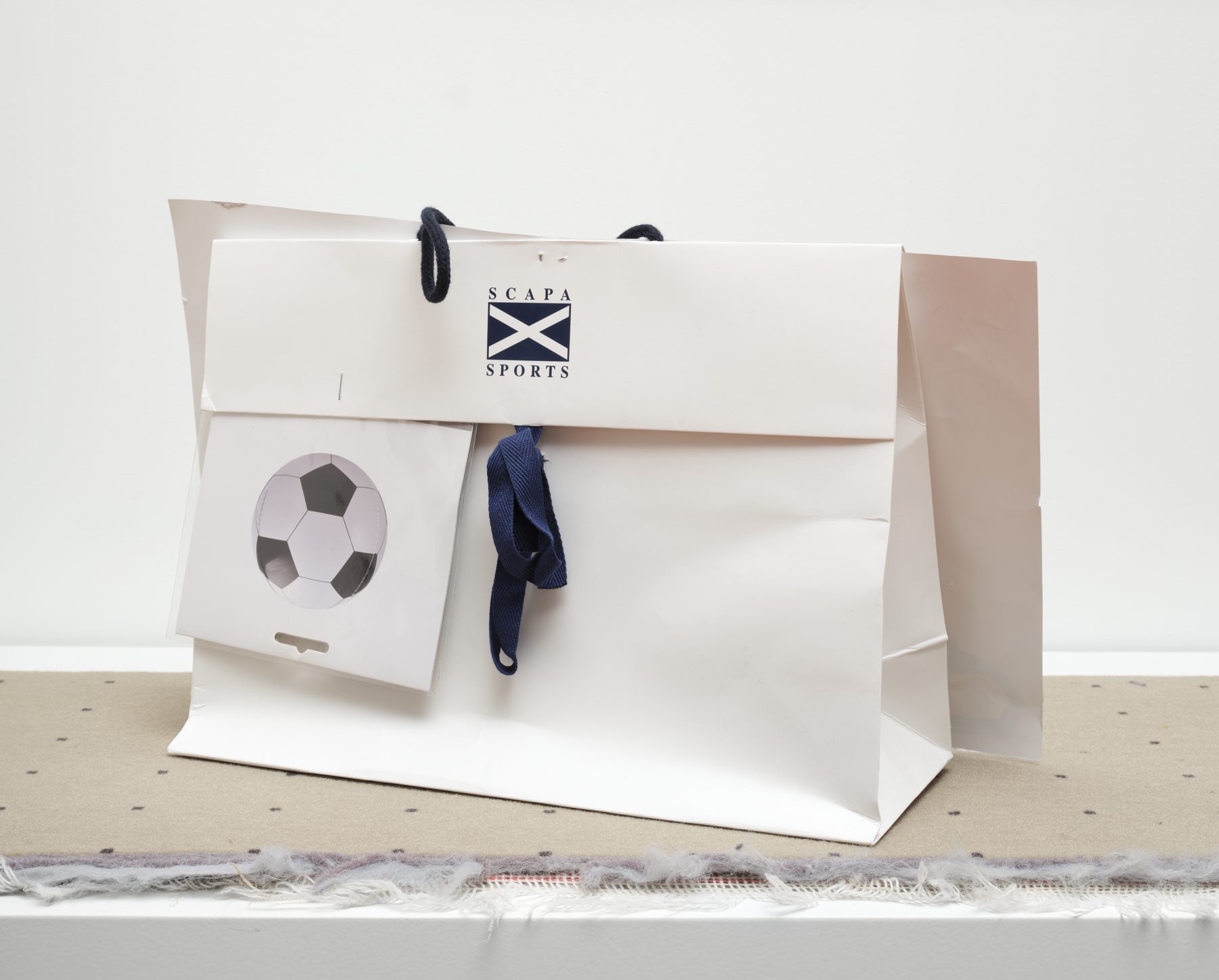
I was increasingly searching for contrasts with themes like the artificial, which was often translated into the kind of material I used: plastic or mops versus more artisanal materials like felt or ‘nature versus city’. I became fascinated by the figure of the palm tree, which would inhabit various contexts as a kind of playful alter ego. Artists like Yto Barrada spoke to me, think of ‘I’m not exotic I’m exhausted’. I discovered how globalization led to the first palm tree arriving in Belgium in the sixteenth century, for example, by chance in an exhibition at KASK during my graduation year. I also felt that the palm tree was underexposed as a historical element and an important ‘non-tree’. The palm tree is often associated with luxury or vacation, but this depends on your perspective. Sometimes I also choose materials like the mop or paper shopping bags for their underexposed status: a mop is used as a tool to clean the floor, a shopping bag has a certain status or is an eye-catcher for the half-hour you stroll around with it on the street, but then it gets thrown away.
It’s the freedom and the ‘doing what you want’ that makes you spend a few days a week in your studio making things, I assume. The pleasure of creating that own universe. Then it’s still the art of carving out your own place in the art world, to see and be seen.
I think everyone does that in their own way; it’s not evident when you start comparing where other artists are already at, but I believe the main thing is how you feel about your work and how you keep moving forward.
HVC: Did you find it too limiting to just show on the wall?
Maybe. It’s about wanting to show ‘even more’ especially. (laughs) But particularly for myself, of course. When you’ve made a series, it’s nice to bundle them. Or just take one element from a series and create something from that focus. Purely as a thought exercise sometimes: what was that series of works really about? But it started first with my archive of images that I was going to paste into hand-sewn books made from mops.
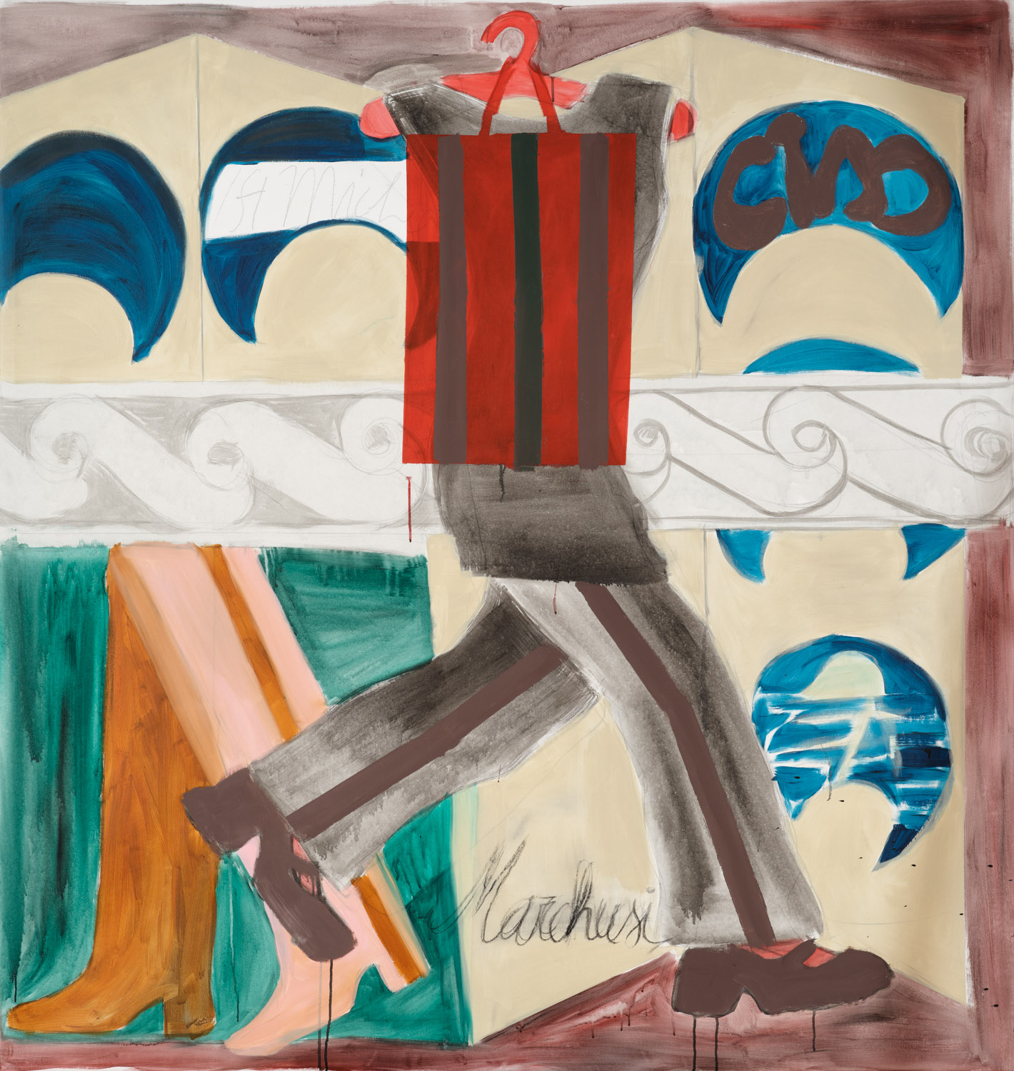
Series arise spontaneously for you. Just think of your countless works with the Euromillions logo. Before you knew it, you made connections like ‘wiping your feet on’, and suddenly you have a whole series, from which other ideas emerge with image fragments of brand names, legs, costumes, fashion…
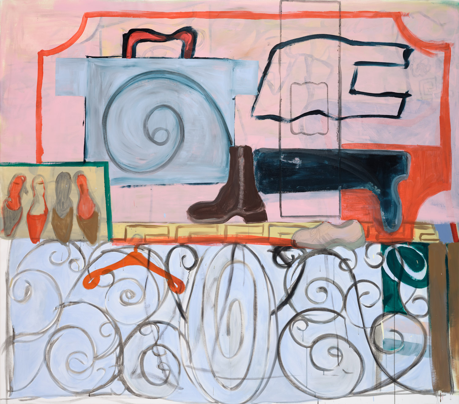
Then there were more series with gates with ornaments.
HVC: What intrigued you about that?
I think the combination of the clean lines or outline of the gate’s structure, combined with the curled ornaments. Often, you build your surface on a large canvas in an abstract way, and it’s handy to divide your surface. Those ornaments often unconsciously take on different forms, and suddenly you see something figurative in them, but mainly because it’s delightful to just trust your eyes and let your hand follow. I often work from photos or sketches, as well as from observation, but during the work, an unconscious filling also arises, a spontaneity that allows or controls you. Also, what happens in front of the gate or what is hidden behind it is intriguing to me and creates a mystery and tension as if everything seems okay, but something could also happen.
Your final work was about ‘Palm Trees’. I remember seeing that exhibition in the Blanco exhibition space in Ghent, being delighted by it, and promptly inviting you for an exhibition for Kunst@poel17. That’s how the ball keeps rolling, and you frolic from exhibition to exhibition, purely because your work is appreciated by viewers.
That was already about five years ago, which feels like a long time. (laughs) I have had a nice journey, but there is still a kind of pressure that by the time you’re thirty you should be with a gallery, or that you feel you’re only being asked through connections, by knowing the right people... I find it important to present my work in various ways, which can also be through the books I make. This way, you reach a broader audience and – I notice – I attract very diverse people.
Your young oeuvre is a visual collage of figurative and abstract elements and is characterized by thick black contour lines combined with pastel colors.
It’s a combination of things. My color palette is quite extensive; I dare to use brown and gray nowadays. I used to think those were ugly colors. (laughs) I sometimes find it strange how people mainly notice the ‘pastel colors’ because I actually use a lot of contrasting colors. First, I visually notice something, an object, a book cover, or a word like Deluxe Palux as the title of a book, for example. What I would then associate with the French word Pas luxe compared to Deluxe, but palux apparently means gold-dust. Or words that are visually appealing because of the way they are written, associated with high and low culture, or song titles like Easy Street by Julie London or Isabelle Antena... Automatically, I associate and seek out those contrasts. And if an image is too frivolous, I dare to tilt it.
Dampen the lollipop factor! The shoe as a ‘symbol’ often recurs, and that’s no coincidence. You like to walk around. Visually, you disrupt the viewer with all those disharmonious and seemingly unrelated elements together. Both visually and thematically, there is both intrinsic and explicit humor in your work, I suspect.
I think you can always find connections if you have a bit of imagination, but humor definitely helps here. It’s often the small details that allow you to link a feeling to an image or trigger a certain perspective that makes you think or takes something less seriously.
HVC: Does such a painted drawing arise ‘directly on canvas’ or do you construct a thorough preparation in your sketchbooks?
In the past, I made preliminary sketches and executed them on a larger scale, but these were quick sketches, never really developed. Now I have less of an idea of what my final work will look like. It comes more spontaneously nowadays, but the more you sketch beforehand, the better you can construct a kind of intensity in your studio. I also look at photos in the meantime, and I try to combine all those scenes at once; think of the worlds of the present and the past. I find nostalgia a double-edged word, yet I find it interesting to look at how a certain design or clothing is no longer in circulation. But if you look at Italy, for example, you do see that a certain decorum remains.
You see your practice as ‘capturing’ things. You cut out details from your surroundings, which simultaneously feeds your archive of images. I also feel that collage and assemblage art through it. And you experience the layering of elements that you worked away, allowing you to discern both figurative and amorphous forms, which gives depth to the plastic elements of and in your work.
It’s always a surprise for me. You never know why you feel that something needs to be worked away. It’s a kind of image you have in your head that needs to fit, just like the right tension. Sometimes it becomes too much and feels too busy or chaotic, and I start to repaint things, but with a work on paper, you can hardly do that: you always have to find a solution more quickly and directly. I often find that interesting because you are then engaged with the medium of drawing itself, or at least you are constantly reminded of it.
HVC: What reactions do you generally receive?
They are very varied. I think you have to learn to live with that as an artist. I can’t expect everyone to give me good, in-depth feedback.
HVC: Do you secretly want everyone to melt for those colorful images of yours?
Of course, you hope to attract people who really ‘see’ the image and understand my aesthetics. Or who fall for the same references. Often, people feel the dynamism that is in my work, which makes them want to do something active themselves.
HVC: Do you want to create the good vibes?
Not necessarily. During my studies, there was a teacher who asked me, ‘Don’t you ever feel sad or bad, because you only make work with bright colors?’ But maybe I use that visual language precisely because it pulls me out! By the way, if I haven’t been in my studio for a few days, I don’t feel good, so ultimately this coincides.
HVC: When is a work ‘finished’? Do you let it rest a bit in your studio or...?
I don’t let them hang on my wall for too long. I feel quite quickly when they are ready. And I want to have space to start with fresh work. (winks)
HVC: You want everything to progress. Additionally, you want to consciously preserve the freshness of your visual language. Is that something you also appreciate in other artists?
I don’t like things that are too heavily worked. And I can also appreciate it when artists construct total installations. I saw Camille Henrot’s Carte Blanche at Palais de Tokyo some time ago; her installations have stuck with me. I also discovered Ana Jotta, a Portuguese artist, during my residency at two exhibitions in Paris. It’s so fresh how she works with a multitude of images and transitions from a wall drawing to an installation with domestic elements. Also, with the Italian designer Andrea Branzi, you see in his book Animali Domestici that duality between materials that seem light and are actually a kind of metal imitation bamboo. Or in the exhibition about Josef Hoffmann, which is currently running at the Museum of Art & History in Brussels, titled Sous le charme de la beauté, where his design objects are placed in a fresh scenography alongside his drawings and architectural gems.
How do you determine your dimensions? Is it according to the mood of the day? Because I see even XXXL work hanging here.
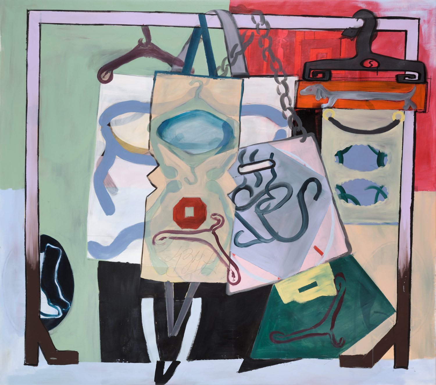
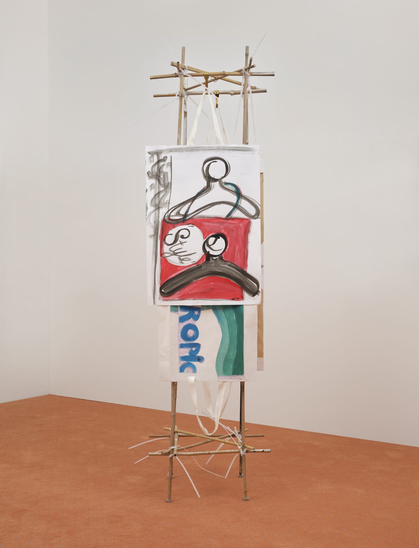
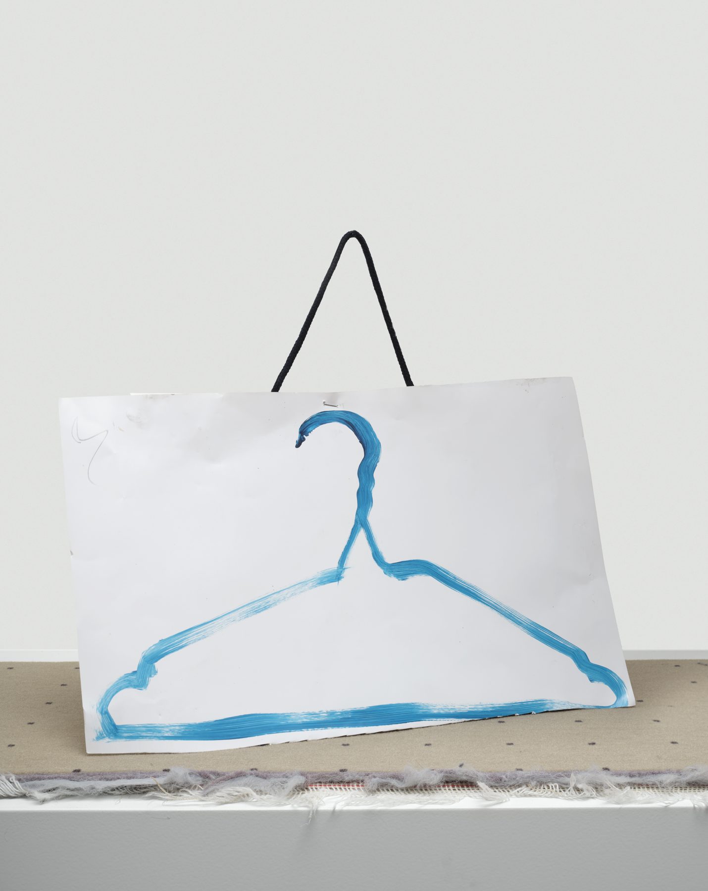
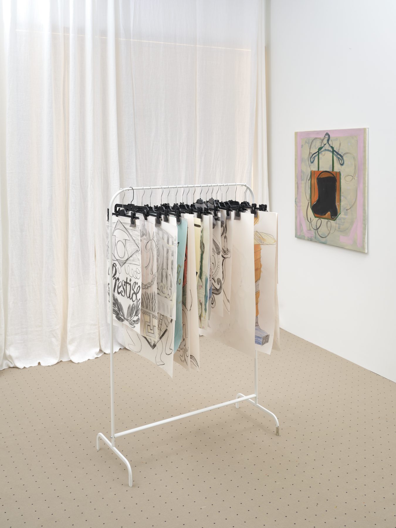
I work simultaneously on different formats. Perhaps that's also to keep challenging myself; each format feels different. You also place everything differently in the image. And with a large size, I am forced to work differently and view my work in another way. This way, you stimulate yourself not to fall into your comfort zone. In my latest series with coat hangers, I find those large works fitting, as if I can hang everything on them. Even within drawing, I find that a nice element. I am drawing fewer human figures, and perhaps a coat hanger is something that makes me think of shoulders; you can literally and figuratively hang anything on it. I like to play with that.
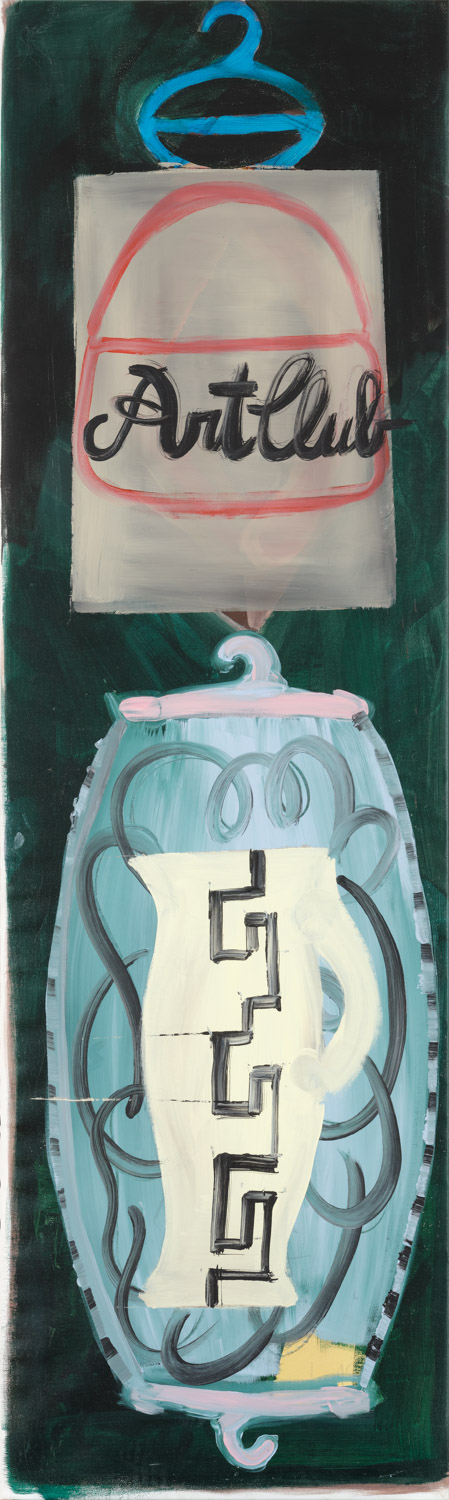
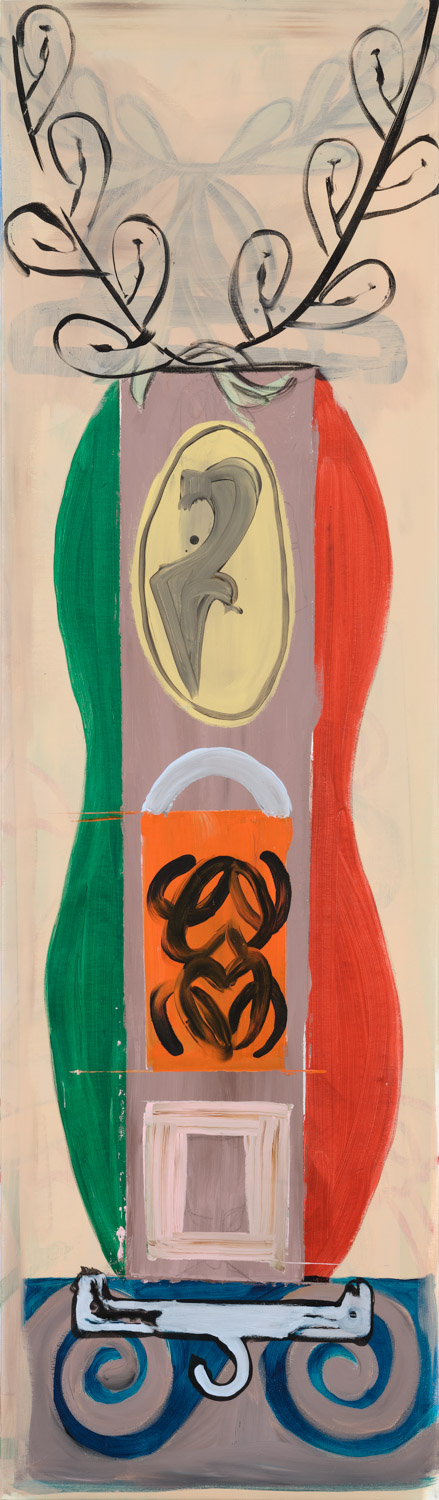
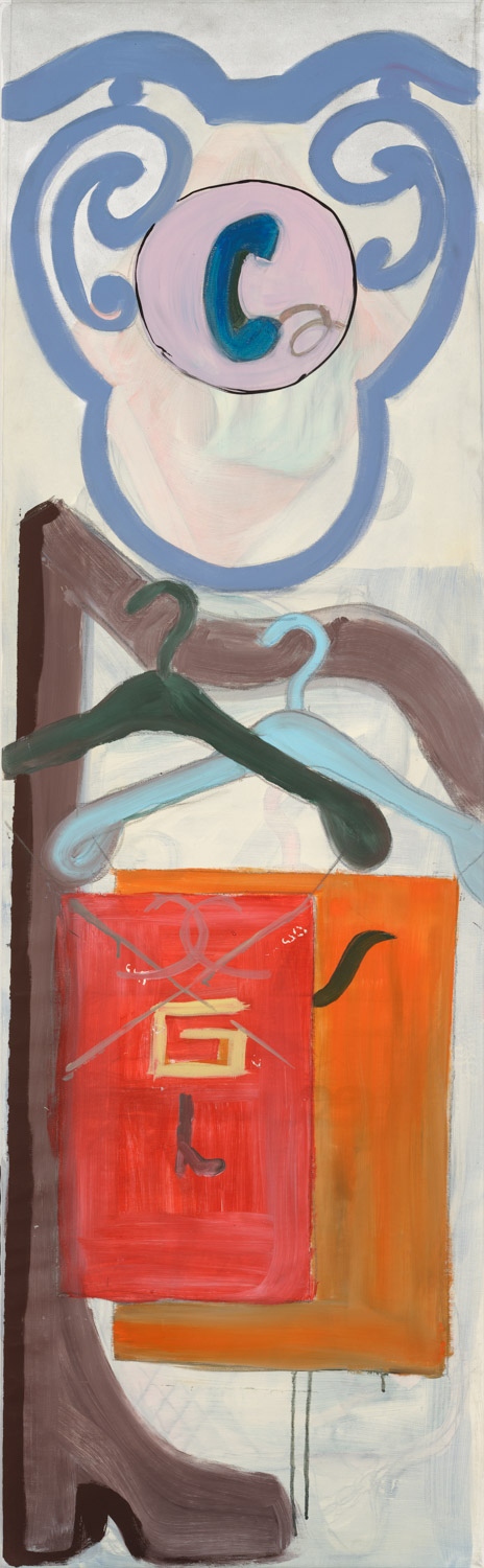
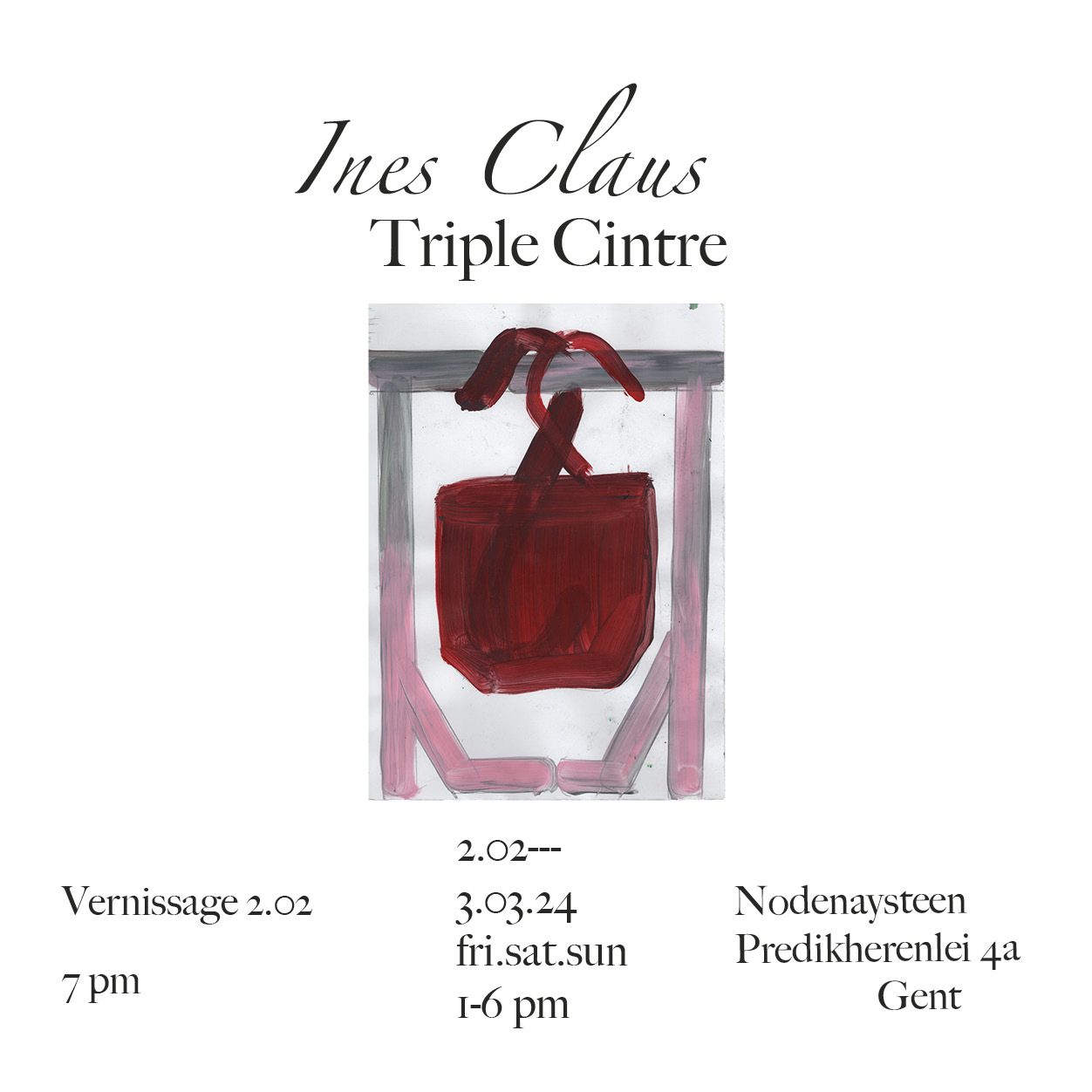
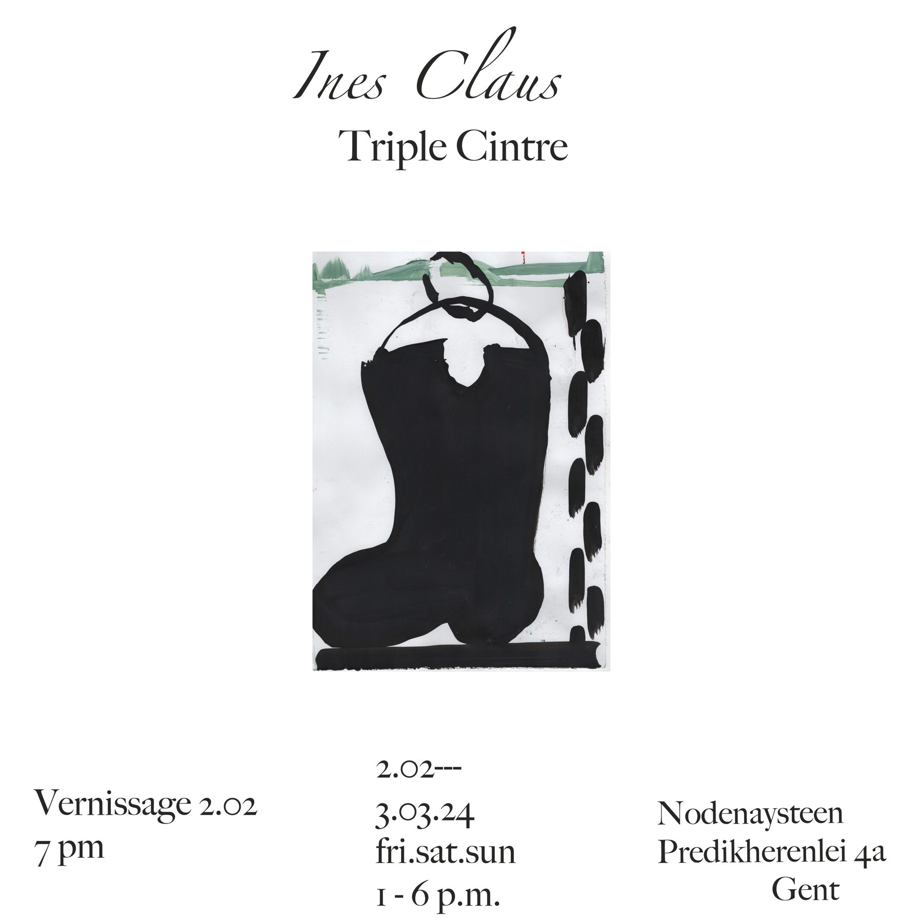
HVC: Is this also ‘the coat hanger’ where you will hang your exhibition Triple Cintre, now in February 24, at the Nodenaysteen in Ghent?
Partly yes. In my invitation, I describe it among other things as ‘the accrochage of drawn thoughts’. It became a series about ways of hanging, methods of showing a stacking of associations, and a kind of re-organizing of items and thoughts from after my residency in Paris. You see this in works with titles like Garderobe Fridge or Penderie de rue, where I show a kind of clothing rack where street signs (Emblèmes) and boots are hung.
An exhibition is always a key moment to pause and reflect on your work. Two years ago, you had a solo exhibition at the Ghent Rufus Gallery under the title Mode de vie, referring to the lifestyle and aesthetic language of Parisians. You designed the magazine Paris La Sape to accompany it.
I was on an artist residency at Cité des Arts in Paris, hence the title. It is always refreshing to start from scratch in a new studio, even though it was much smaller. But it allows you to approach your research in a different way; it broadened my visual language.
HVC: Paris, of course, leaves no one untouched! That world city gradually seeped into your work. Do you want to make people look at your work differently with your publications?
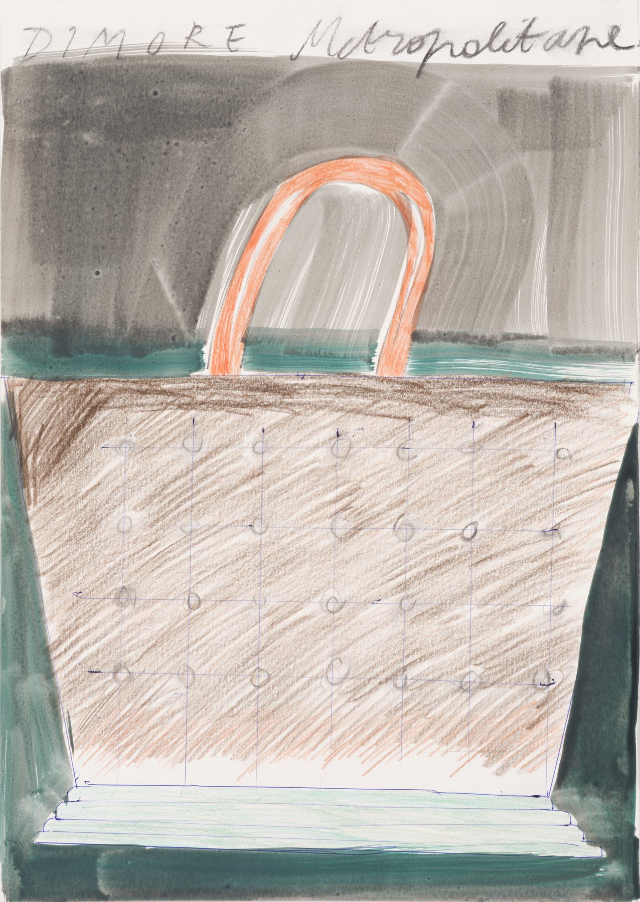
I find the combination of work on the wall and looking at my publication at the same time ideal. I don't necessarily want them to look at my work differently, but it often provides a kind of extra insight into visual thought processes. The magazine gives you a glimpse into what I gathered on-site. There is an alphabet in it, where not all letters are present. I started linking certain symbols to a letter. In the beginning, you see a series of bags, the abc portables, with references to these templates or elements from my work that often play with brands/logos or become a kind of literal carriers of drawings. For example, the Lauwerkrans (L) is associated with all images related to food and the kitchen, with, for instance, the drawing Roman Garlic, inspired by the exhibition Natures mortes from the Louvre. Or photos of my countertop with a beautifully served plate and a light green tablecloth with spilled wine. etc. For an Art Book Fair in Milan and the Antwerp Academy Art Book Fair, I created an edition of bags with templates that refer to symbols in my book. Sometimes people know your work on social media, and this gives you the chance to meet at international art book fairs. That’s how I met publisher and artist Dario from Gaffa Worldwide (CH) in Milan, and he will publish a book with a series of drawings in risoprint.
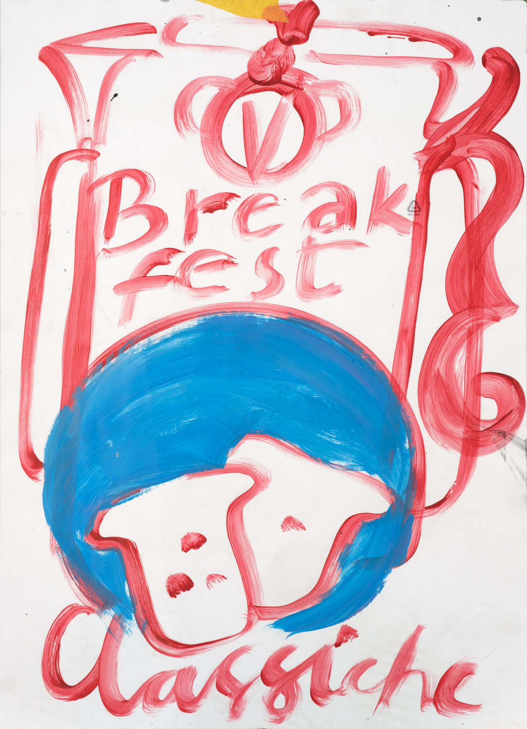
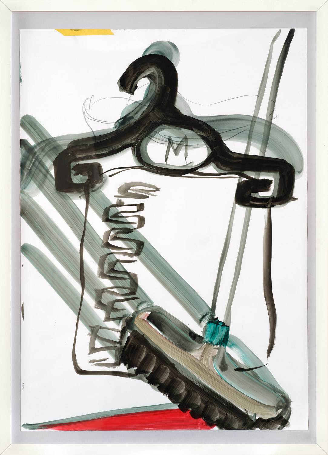
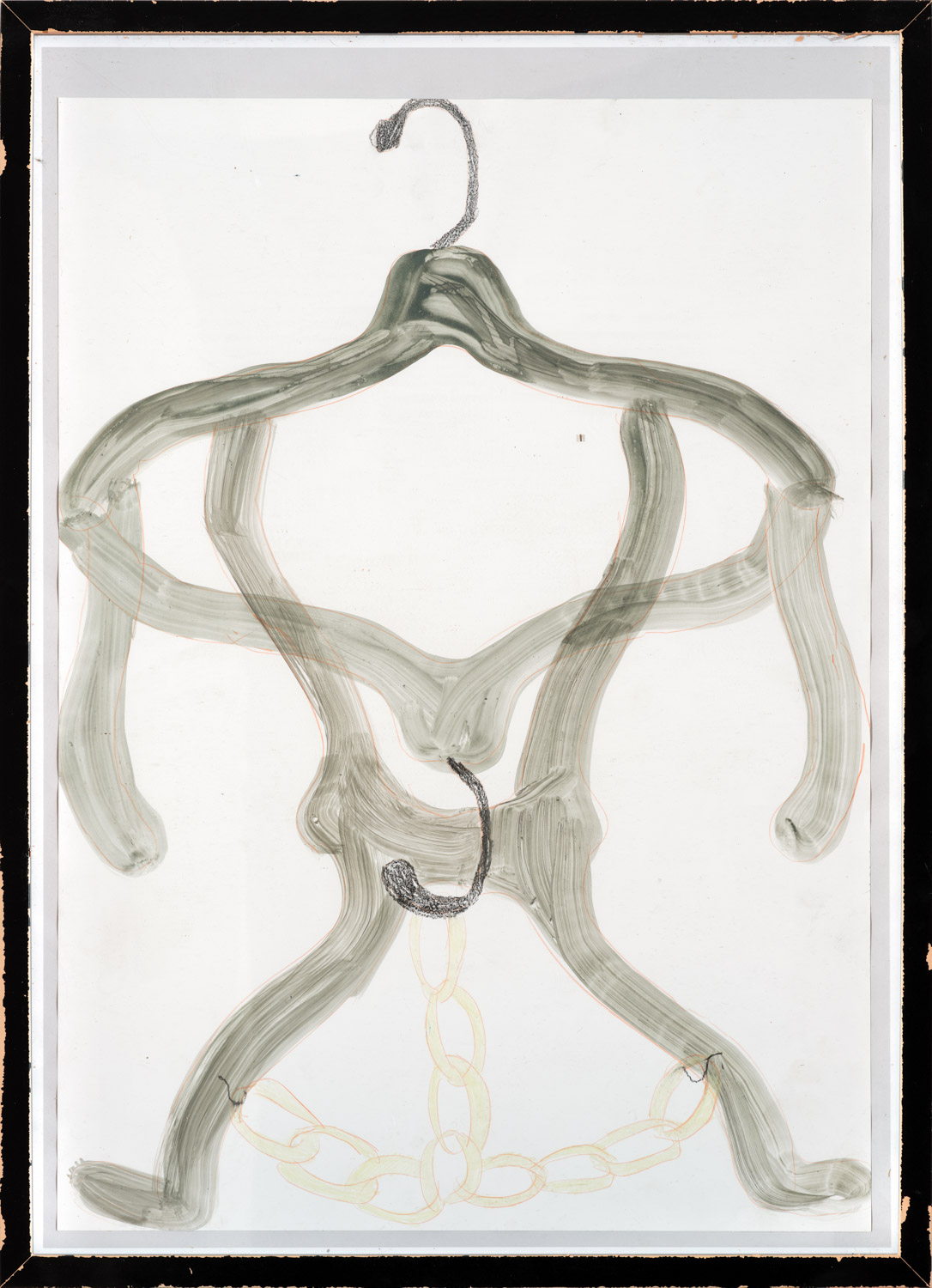
Present and past reflect each other and flow over and into your work in all its layers. You like to play with the everyday nature of materials and images, with the wonder for an ordinary object that leads to another idea or object.
Nothing is better than when everything coincides. And often, it’s coincidences that strengthen the concept.
And you artists can’t escape that Instagrammable touch of 2 by 2 cm.
Such a small format on screen gives a very different impression of your work. It looks much cleaner than in reality. You don’t see those plastic imperfections. Just like in my drawings, I don’t work too methodically on my social media. I post spontaneously about what I’m working on. I find it a nice visual platform because it creates a whole unique world. I also have an account under Claus Books, which is more anonymous, but I find that has its charm.
HVC: How do you see your practice evolving further?
During a residency, it’s especially nice to meet other artists from all over the world – there are about three hundred in Paris. There, I felt inspired to collaborate with other artists, whereas before I just wanted to do my own thing. I realize that I also want to be very generous in what I show. Or perhaps I want to explore how to present my work through installations; to show that multitude through collaborations with other artists or designers.
Your themes are light, and you also start from form. Nothing wrong with that; on the contrary, a work can bring joy, be pleasant to look at. I find that playfulness attractive. The joy of expressing oneself, being in your element, radiates from it. Your works reinforce each other as well. I think many people can appreciate your drawings.
Thank you! My stories are either created while drawing or only afterwards, which allows for many possible open interpretations. I don’t really start from an existing story or text. It makes sense, I think, that I start from something visual because it ultimately revolves around the image. But sometimes it happens that you stumble upon a piece of text on the back or inside flap of a book, where you have that same feeling. I try to convey that as an underlying concept or feeling. Like in ‘Mode De Vie’: Mode comes from the Latin ‘modus’ (way) and emerged at the end of the Middle Ages. It described the informal codes that directed behavior in society, more specifically the ways of dressing. It’s a kind of critical observation where you select elements from society, but not in a literal way. Is that why it feels light? It feels as if an image is then worth less... It’s more about nuances and hints at what is happening, but those are usually so hidden that not everyone sees them. Even colors or certain color combinations can be used as a political wink.
You don’t make it easy for yourself; there is little context. And your publications are not uncomplicated either. I find your work difficult to articulate; there are no theories attached to it.
Why little context? I feel like I might be giving too much. Yet I want to create that openness. I also suspect that my publications are not that difficult: they are just tools to present your work in a different way, and it’s super exciting to work towards them. I never think in advance: this must be the book or so. I assume many artists put too much pressure on this. I would enjoy thinking about how the work of other artists is best represented, or conversely: handing my work over and seeing what comes out if someone were to design and publish a book for me. It’s fun to play with this; so that a book doesn’t become an illustration of what you show, but something in itself, like a visual maze where you take out what you want and where no structure is imposed.
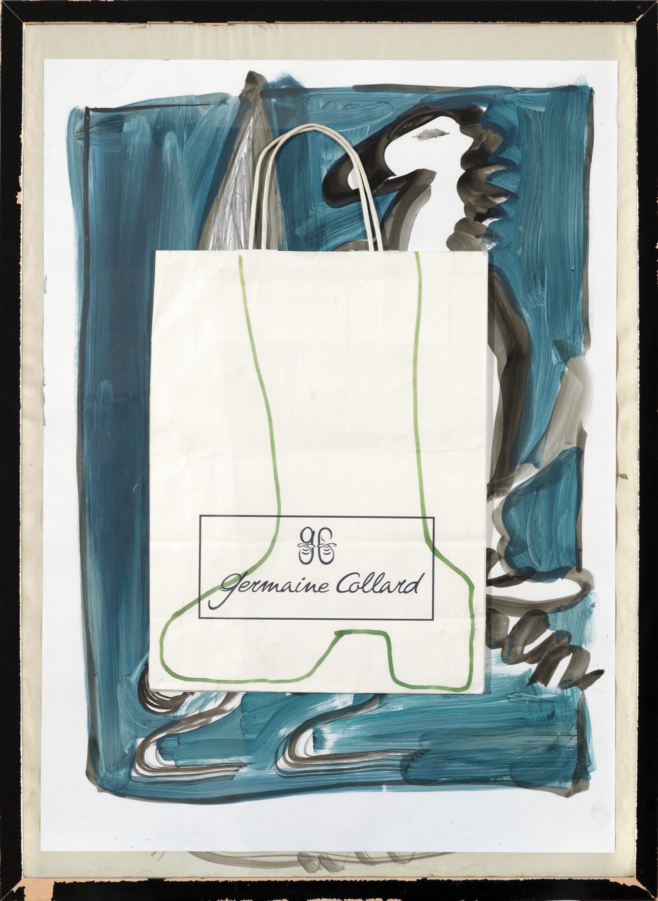
HVC: Do you consider yourself an intuitive artist? Does ‘the day’ influence what you create?
That will definitely have an effect on the choices you make. Maybe on a frustrating day, I’m less cautious, I have more of a ‘Fuck it, I’m going for it!’ attitude. I try to use that power of creation to push through things, to bend that energy; to transform it into another vitality, so you don’t get stuck in it. But I find that label so one-dimensional; there is never just intuition; there is always some framework. I never wait for something to just appear on the page.
I don’t feel that making work is ‘labor’. Because studio time takes time away from life outside. You really have to be able to pull yourself away from the so-called real and practical life outside.
On one hand, it is 'work' of course, but I can really work for hours and lose track of time. However, it also helps to clear your head first by doing some 'household' tasks and then heading to the studio fresh. Even when you teach, it takes a while to distance yourself. But right now, that's only eight hours a week, which is manageable.
HVC: How do you try to make a difference?
HVC: If you look too long at other artists, you start to compare, and that’s not always motivating. (laughs) I have always felt that by constructing quite personal works, I generate a difference nonetheless. I don’t see many drawings like mine. Do I sound pretentious?
Not at all! You are also supported, which gives you courage as well. Musician Björk says: ‘You can only do something artistic if the judgment of others doesn’t affect you.’ A statement by artist Wim Delvoye is: ‘Art is not useful, it’s pure entertainment.’
I don’t agree with that last statement; then your work is only seen as something decorative.
And it is anything but that, Ines!
HVC: , January 24
Photos: STEVEN DECROOS
Nodenaysteen, Predikherenlei 4a, 9000 Ghent
Until March 3, 2023, always on Friday, Saturday & Sunday from 1 PM to 6 PM or by appointment.
www.nodenaysteen.org, www.inesclaus.com